Vertical Business Cards
Product Key Features:
- Available in various thicknesses and finishes for enhanced feel and durability
- Gloss and matte finish options for vibrant or classic designs
- High-quality print for detailed, professional appearance
Couldn't load pickup availability
Need help, a custom request, or a specific budget in mind? Email us, we’ll go above and beyond to make it work for you. hello@printdrill.com
Customer Product Photos ✌︎㋡
(Proof of Work)
Vertical Business Cards - Portrait Cards for a Distinctive First Impression
Make your contact details stand tall with portrait business cards designed for Vertical presentation. These vertical layout cards shift attention, emphasize branding elements, and help professionals in industries that favor a taller canvas—designers, real estate agents, stylists, and boutique service providers—stand out in a stack of horizontal cards. Clean, simple, and focused on practical branding impact, these cards are ideal when you want a modern standing card that highlights logos, portraits, and vertical layouts without extra complexity.
Looking for general-purpose Business Card?
If you’re evaluating options, it’s worth exploring our standard version of the Custom Business Card here. View our main Business Cards page here.
Page title
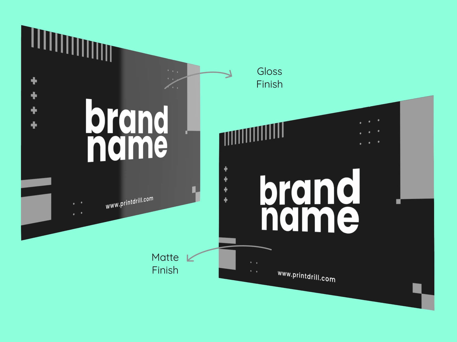
Gloss Finish Vs Matte Finish
Color Vibrancy
- Gloss: Enhances color vibrancy, perfect for photo-heavy designs.
- Matte: Colors are softer and slightly muted, offering a subtle look.
Durability
- Gloss: Highly durable, resistant to bending, folding, and moisture.
- Matte: Less durable, more prone to bending and damage.
* Durability depends on the thickness (pt) of the card.
Readability
- Gloss: Can cause glare under certain lighting, affecting readability.
- Matte: Non-reflective surface ensures easy readability in all lighting.
Professional Look
- Gloss: Shiny and eye-catching, but can be perceived as flashy.
- Matte: Clean, modern, and professional look, ideal for formal use.
Fingerprint Visibility
- Gloss: Prone to showing fingerprints and smudges.
- Matte: Resistant to fingerprints and smudges.
Writing Surface
- Gloss: Difficult to write on due to the smooth, coated surface.
- Matte: Easy to write on with a pen or marker.
Protection
- Gloss: Offers better protection from moisture and wear.
- Matte: Colors may fade slightly over time, depending on the material quality.
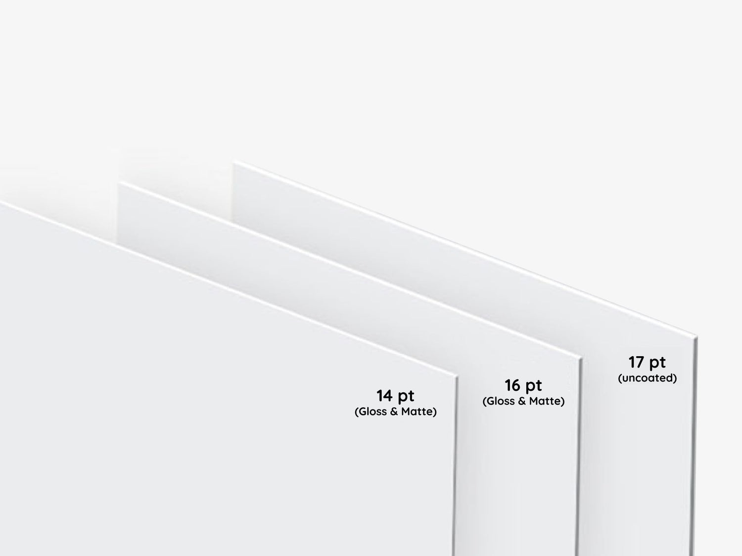
Choosing the Right Paper Thickness for Your Business Cards
14 pt Paper
- Popular standard for business cards
- Thinner and more flexible than 16 pt
- Rigid enough to avoid bending or flopping
- Affordable and great for mass distribution
- Ideal for handing out large quantities at events
16 pt Paper
- Slightly thicker and heavier than 14 pt
- More durable, sturdy feel
- Premium and substantial impression
- Great for high-level meetings and impressing clients
- Less likely to bend or crease
Uncoated 17 pt Paper
- Heaviest of the three, with a luxurious feel
- Uncoated surface, ideal for writing
- Tactile, natural, or artisanal appearance
- Best for brands aiming for a premium or unique aesthetic
- More durable and thicker, lasting longer in use
Collapsible content
Product Specifications
Standard 14pt Gloss Finish:
- Glossy finish enhances color vibrancy.
- Sourced from sustainable materials.
Standard 14pt Matte Finish:
- Non-reflective matte surface for a classic, elegant look.
- Better writability compared to gloss.
Premium 16pt Gloss Finish:
- Thicker, ultra-stiff cardstock with a high sheen for vivid colors.
- Ideal for more premium, standout designs.
Premium 16pt Matte Finish:
- Thick, durable cardstock with a smooth, professional matte finish.
- Offers a more substantial, refined feel.
Premium Plus 17pt Uncoated:
- Thickest option with a natural, uncoated texture for a luxurious touch.
How to Order?
Explore the most convenient way to order Signage and Print products online.
Step 1: Customize Your Product
Choose from material types, sizes, finishing options, and extras like lamination. Unsure? Our pre-selected options work for most needs, but feel free to adjust based on your preferences.
Step 2: Graphic Design Options
Upload your own design, use our templates, or let our designers create something for you based on your instructions.
Step 3: Upload Files Later (Optional)
If your design isn't ready, no worries! You can place your order now and upload the design later.
Step 4: Proofing & Approval
We provide free proofing to ensure everything looks perfect. You'll approve the final proof before production starts.
Question & Answers
FAQs for Vertical Business Cards
Q: Can I order portrait business cards in a vertical layout?
A: Yes. This product supports vertical orientation to create portrait business cards suited to taller layouts and creative vertical branding.
Q: What makes vertical layout cards different from standard horizontal cards?
A: Vertical layout cards present information from top to bottom, which can change visual hierarchy, emphasize tall imagery or logos, and make your card more noticeable among horizontal cards.
Q: Who benefits most from tall business cards?
A: Professionals who rely on strong visual identity—designers, real estate agents, boutique retailers, and service providers—often benefit from the distinctive presentation of tall business cards.
Q: Are there design guidelines for creating a vertical business card?
A: Keep layouts simple, prioritize legibility, align brand marks and text vertically, and leave clear margins so the design reads well in a portrait format.
Q: Can I include a portrait photo or vertical image on the card?
A: Yes. Vertical cards work well with portrait photos or tall imagery; place the image to support the overall information flow without obscuring contact details.
Q: How should contact information be arranged on a vertical card?
A: Arrange contact fields in a straightforward top-to-bottom order—name and title near the top or center, with phone, email, and website placed below for easy scanning.
Q: Will a vertical orientation fit in standard card holders or wallets?
A: Vertical cards are similar in footprint to other business cards and generally fit into most card holders; consider storage and display methods when finalizing dimensions and layout.
Q: Can I preview my vertical business card before ordering?
A: Proofing and visual confirmation options are typically part of the ordering process so you can check orientation, layout, and alignment before printing.
Q: Is the vertical format suitable for both formal and creative brands?
A: Yes. Vertical business cards can be adapted to a range of styles—from minimalist and formal to bold and creative—by adjusting typography, spacing, and imagery.
Q: How many design elements should I include on a vertical card?
A: Aim for a focused design with a few strong elements—logo, name/title, and primary contact—so the vertical format remains clean and legible.
Q: Can vertical cards be integrated into an existing brand system?
A: Yes. Using consistent colors, typefaces, and logo treatments ensures that vertical cards align with your broader brand identity.
Q: Are there any common mistakes to avoid with vertical business cards?
A: Avoid overcrowding, tiny type, and placing critical information too close to the edges. Keep the design intentional so the unique orientation enhances rather than detracts from your message.
Q: What if I need help adapting my horizontal design to a vertical format?
A: Consider simplifying elements, rethinking image crops, and reorganizing information into a top-to-bottom flow; designers often convert assets to a vertical composition for clarity and impact.
Collapsible content
More info on Vertical Business Cards
Why Choose Vertical Business Cards
Portrait business cards (vertical layout cards) change the way recipients perceive your brand. The tall business cards format naturally draws the eye along a vertical flow, helping essential information—logo, name, title, and contact details—read in a purposeful sequence. This orientation is an effective choice for anyone seeking creative vertical branding that feels contemporary and distinct from standard horizontal formats.
Key Benefits for Vertical Use
- Enhanced visual hierarchy: Vertical layout cards let you stack brand elements in a clear top-to-bottom order, making it easier for recipients to process key details quickly.
- Stand out physically and visually: Unique orientation cards are less common than horizontal cards, increasing memorability when exchanged at events or left behind.
- Better fit for tall visuals: Modern standing cards accommodate headshots, vertical logos, and long lists of services without crowding the design.
- Clean and professional presentation: A portrait approach supports minimalist, high-impact layouts that communicate sophistication and intentional branding.
- Flexible for multiple industries: Vertical business cards work well for creatives, consultants, real estate professionals, wellness practitioners, and boutique retailers who benefit from contemporary presentation.
How Vertical Orientation Works for Different Industries
Vertical business cards translate especially well for roles and industries where imagery, titles, or branding elements are vertical in nature or where a standout physical format helps spark conversation.
Design and Creative Services
Designers, photographers, and creative studios can use the vertical layout to showcase a vertical crop of artwork or a prominent logo, reinforcing aesthetic sensibility right in the hand of a prospect.
Real Estate and Architecture
Agents and architects often use tall business cards to feature building photography, property listings, or a vertical logo lockup, matching the scale and feeling of architectural materials.
Wellness and Personal Care
Stylists, therapists, and boutique wellness providers can pair vertical layouts with portrait imagery or service lists that read naturally from top to bottom, aiding recall and conveying a refined brand.
Design and Customization Considerations
When planning a vertical business card, focus on clarity and balance. Keep key contact information in a logical vertical sequence, prioritize legibility, and allow breathing room around logos and text. Consider using a striking focal element near the top, such as a logo or icon, and leave clear space for essential contact details lower on the card.
Creative vertical branding can include:
- Prominent vertical logo placement
- Vertical photo crops (headshots, product shots, or architectural imagery)
- Stacked contact fields for clean information flow
- Consistent brand colors and typography that read well in a tall format
Practical Use Cases Specific to Vertical Cards
Vertical business cards are particularly practical in a number of real-world scenarios:
- Networking events: Give a memorable card that stands out in a pile and prompts a conversation about design choices.
- Client meetings: Hand clients a card that doubles as a small portfolio piece when featuring vertical imagery.
- Trade shows and pop-ups: Use tall business cards as giveaway pieces that reflect a modern brand identity.
- Referrals and leave-behinds: Leave a vertical card at partner locations where visibility and uniqueness matter.
Branding Options to Highlight Vertical Layouts
Focus on the elements that best leverage a portrait arrangement. Prioritize a strong top element (logo or monogram), select typography that scales vertically, and use negative space to guide the eye. For businesses using tall business cards as part of a broader brand system, alignment with other materials—flyers, brochures, and signage—keeps brand presentation cohesive.
Environmental and Usage Considerations
Vertical business cards are used and stored much like any other business card. Consider the environments where cards will be carried and displayed—wallets, cardholders, swatchbooks, and display racks—and plan designs so important content isn’t obscured. For frequent handing out, choose a layout and materials that reflect your brand’s practical needs while maintaining legibility and durability in everyday handling.
Five Design Tips to Maximize Impact
- Keep essential text concise and vertically aligned for quick scanning.
- Use a single strong focal image or logo rather than multiple competing visuals.
- Maintain generous margins to prevent a crowded look.
- Choose contrasting type and background for legibility in small type sizes.
- Consider how the card will be photographed or scanned for digital sharing.
Buying Confidence: Practical Value and Reliability
Choosing vertical business cards is a practical way to differentiate your brand while keeping presentation professional and functional. The portrait layout focuses attention, supports a range of branding styles, and fits naturally into business contexts where standing out matters. When preparing your design, emphasize legibility, visual hierarchy, and alignment with your existing brand elements to gain maximum value from this orientation. These cards are a straightforward, long-term asset for networking, referrals, and first impressions.
Looking for our standard options? View our main Business Cards page here.