Bold and Colorful Business Cards
Product Key Features:
- Available in various thicknesses and finishes for enhanced feel and durability
- Gloss and matte finish options for vibrant or classic designs
- High-quality print for detailed, professional appearance
Couldn't load pickup availability
Need help or a custom request? Chat with us or email hello@printdrill.com — we go above and beyond to make sure you’re taken care of.
Free Design Proofing: We check every file for print quality & alignment. If needed, we’ll reach out to fix issues before printing.
Customer Product Photos
(Proof of Work)
Bold and Colorful Business Cards
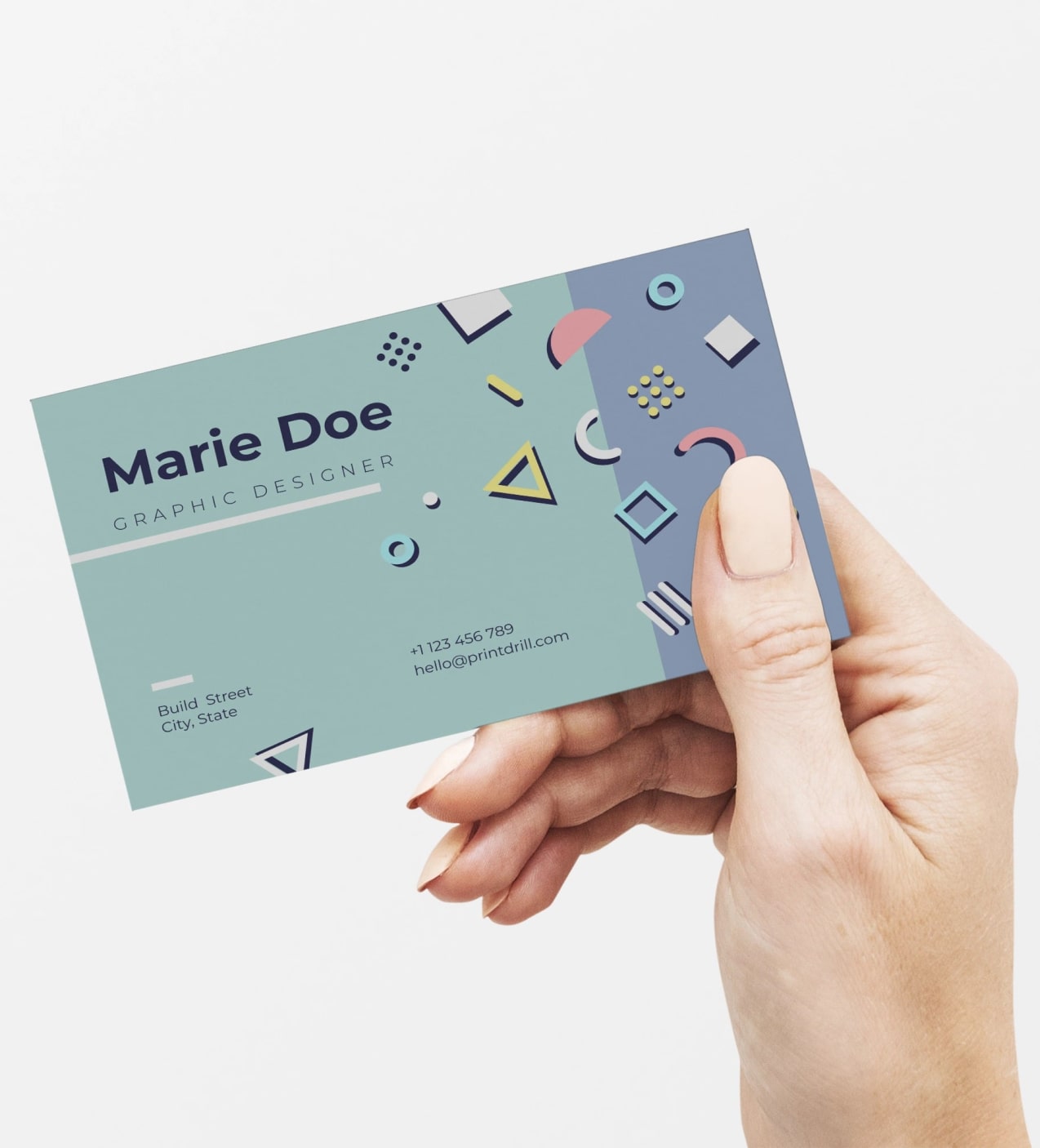
Make a statement with vibrant branding. Our Business Cards are designed for creative professionals and brands that want colorful business cards and high-impact design. Perfect for artists, designers, marketers, and small businesses that favor bright palettes, these cards showcase artistic cards and neon business cards with bold color reproduction and eye-catching layouts. Choose customizable printing options to reflect a creative color palette and leave a memorable first impression at networking events, pop-ups, and client meetings.
Page title
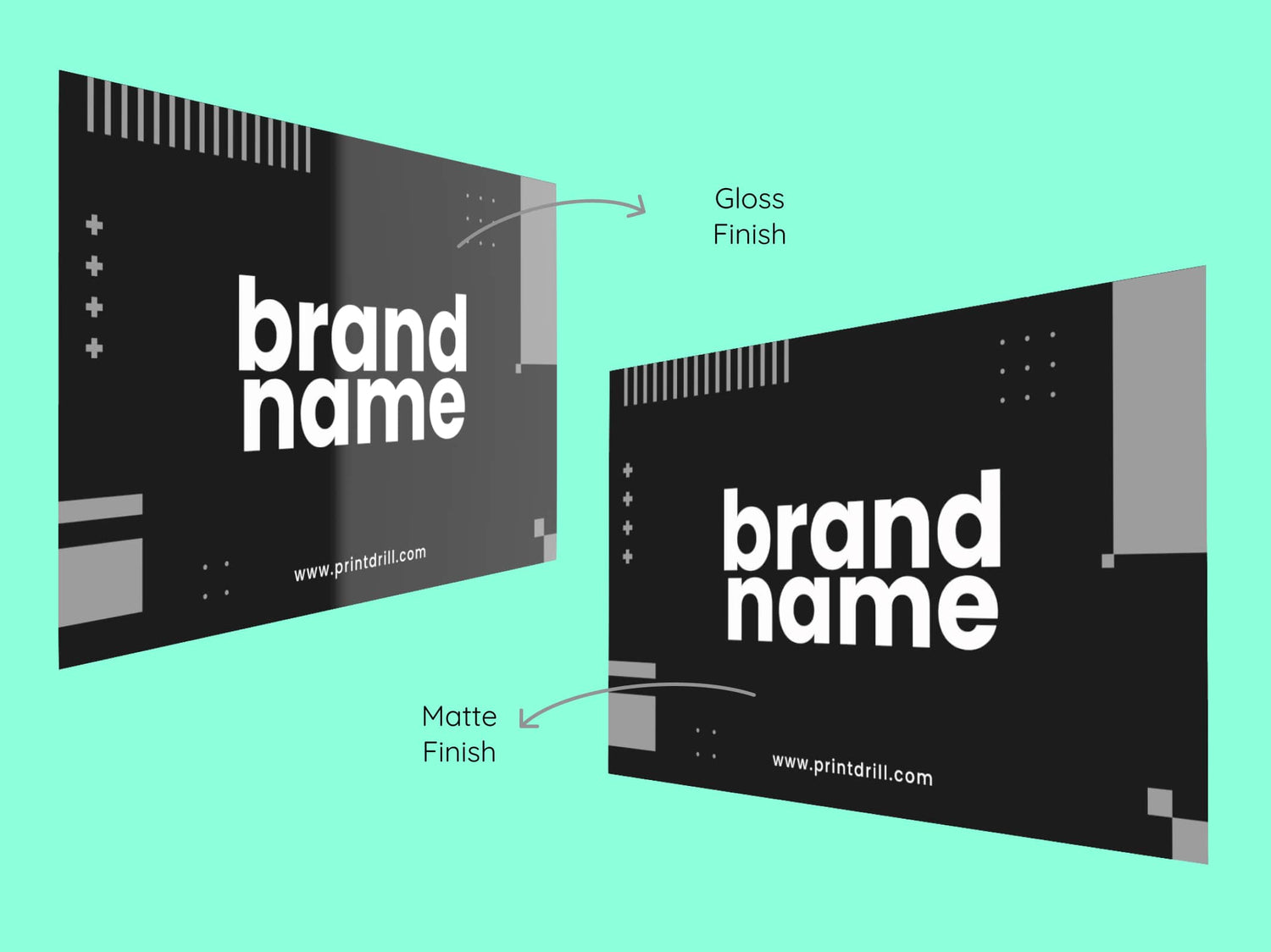
Gloss Finish Vs Matte Finish
Color Vibrancy
- Gloss: Enhances color vibrancy, perfect for photo-heavy designs.
- Matte: Colors are softer and slightly muted, offering a subtle look.
Durability
- Gloss: Highly durable, resistant to bending, folding, and moisture.
- Matte: Less durable, more prone to bending and damage.
* Durability depends on the thickness (pt) of the card.
Readability
- Gloss: Can cause glare under certain lighting, affecting readability.
- Matte: Non-reflective surface ensures easy readability in all lighting.
Professional Look
- Gloss: Shiny and eye-catching, but can be perceived as flashy.
- Matte: Clean, modern, and professional look, ideal for formal use.
Fingerprint Visibility
- Gloss: Prone to showing fingerprints and smudges.
- Matte: Resistant to fingerprints and smudges.
Writing Surface
- Gloss: Difficult to write on due to the smooth, coated surface.
- Matte: Easy to write on with a pen or marker.
Protection
- Gloss: Offers better protection from moisture and wear.
- Matte: Colors may fade slightly over time, depending on the material quality.
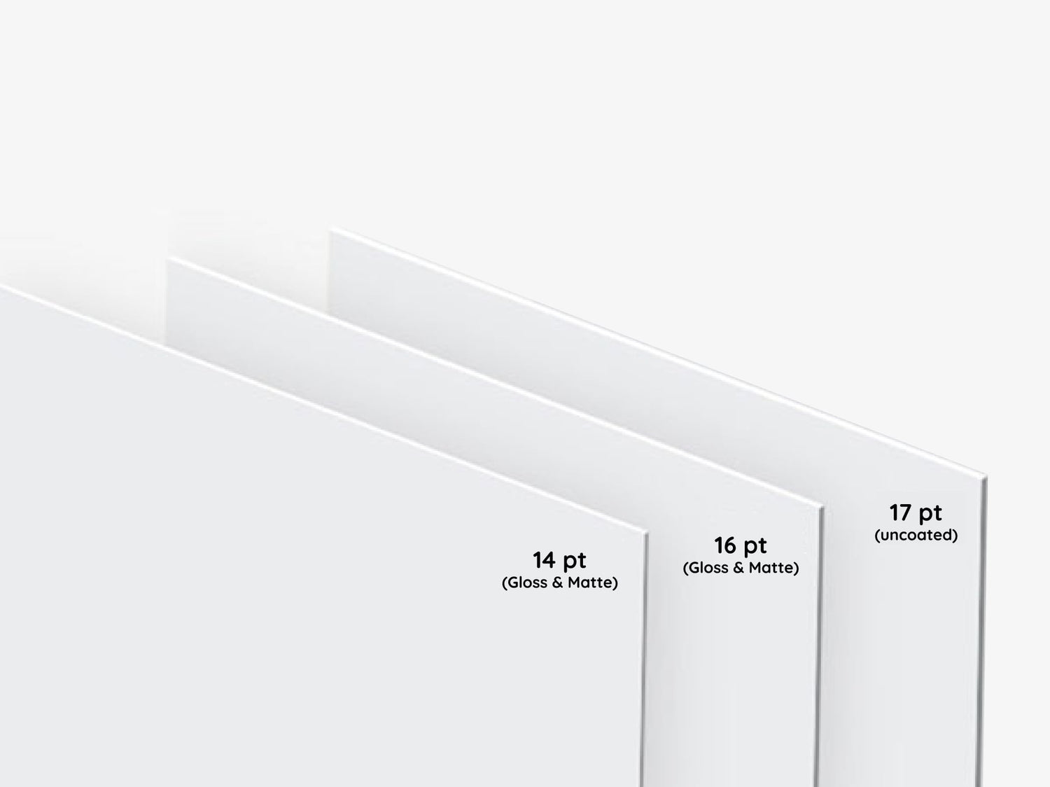
Choosing the Right Paper Thickness for Your Business Cards
14 pt Paper
- Popular standard for business cards
- Thinner and more flexible than 16 pt
- Rigid enough to avoid bending or flopping
- Affordable and great for mass distribution
- Ideal for handing out large quantities at events
16 pt Paper
- Slightly thicker and heavier than 14 pt
- More durable, sturdy feel
- Premium and substantial impression
- Great for high-level meetings and impressing clients
- Less likely to bend or crease
Uncoated 17 pt Paper
- Heaviest of the three, with a luxurious feel
- Uncoated surface, ideal for writing
- Tactile, natural, or artisanal appearance
- Best for brands aiming for a premium or unique aesthetic
- More durable and thicker, lasting longer in use
Collapsible content
How to Order?
Explore the most convenient way to order Signage and Print products online.
Step 1: Customize Your Product
Choose from material types, sizes, finishing options, and extras like lamination. Unsure? Our pre-selected options work for most needs, but feel free to adjust based on your preferences.
Step 2: Graphic Design Options
Upload your own design, use our templates, or let our designers create something for you based on your instructions.
Step 3: Upload Files Later (Optional)
If your design isn't ready, no worries! You can place your order now and upload the design later.
Step 4: Proofing & Approval
We provide free proofing to ensure everything looks perfect. You'll approve the final proof before production starts.
Product Specifications
Standard 14pt Gloss Finish:
- Glossy finish enhances color vibrancy.
- Sourced from sustainable materials.
Standard 14pt Matte Finish:
- Non-reflective matte surface for a classic, elegant look.
- Better writability compared to gloss.
Premium 16pt Gloss Finish:
- Thicker, ultra-stiff cardstock with a high sheen for vivid colors.
- Ideal for more premium, standout designs.
Premium 16pt Matte Finish:
- Thick, durable cardstock with a smooth, professional matte finish.
- Offers a more substantial, refined feel.
Premium Plus 17pt Uncoated:
- Thickest option with a natural, uncoated texture for a luxurious touch.
Question & Answers
FAQs for Bold and Colorful Business Cards
Q: What file formats should I submit for bold, colorful designs?
A: We recommend submitting high-resolution, print-ready files. PDF is commonly preferred for layouts, and high-resolution JPG or PNG may be acceptable for single-image files; include bleeds and keep important elements within safe areas.
Q: Can I print bright or neon colors on my business cards?
A: Vibrant and neon-inspired palettes are supported; plan artwork to maximize contrast and test color choices on proofs where possible to ensure the visual effect meets your expectations.
Q: Are both sides available for printing colorful artwork?
A: Double-sided printing is an option for combining artwork and contact details—use the front for striking visuals and the back for clear, legible information if needed.
Q: How should I handle bleeds and safe areas in my design?
A: Include a standard bleed around the file and keep text and logos inside the safe area. This prevents trimming from cutting into essential elements of your high-impact design.
Q: What design tips help neon or saturated colors stay readable?
A: Use high-contrast type against saturated backgrounds, choose bolder fonts for text, and leave breathing space around contact details to maintain legibility.
Q: Can I use photographic images with a creative color palette?
A: Yes—photography can work well. Use high-resolution files and ensure colors are consistent across images; adjust exposure and contrast for clarity on small-format print.
Q: Will highly saturated colors look the same on screen and in print?
A: Screen displays and printed output can differ. For critical color matching, request proofing or consult the production resources to confirm how vibrant hues will translate to print.
Q: What should I expect in terms of card feel and finish for bold designs?
A: Finish and paper choices influence the tactile impression. Consider a finish that complements your artwork—matte for a muted modern look or a glossier surface to enhance saturation—based on how recipients will interact with the cards.
Q: Are there layout recommendations for artistic cards?
A: For maximum impact, use full-bleed art on one side and reserve the other side for contact details. Keep essential information clear and uncluttered to ensure usability.
Q: Can I order small or large quantities for a campaign?
A: Orders can typically be scaled to your campaign needs. Choose a quantity that aligns with expected events, mailings, or distribution to maximize brand exposure.
Q: How do I include social handles and website links without cluttering the design?
A: Prioritize the most important contact methods and use icons or abbreviated handles to save space. Consider a QR code or short URL if you need to provide more information without adding visual clutter.
Q: What should I check on proofs before final approval?
A: Verify colors, bleed, alignment, spelling, and that all contact details are correct. Inspect how saturated areas reproduce and ensure key elements are within safe margins.
Q: Can I request a sample or proof to confirm vibrant branding choices?
A: Proof options may be available—request one if you need to confirm how bold colors and neon-inspired palettes reproduce in print before finalizing a large run.
Collapsible content
More info on Bold and Colorful Business Cards
Why Bold and Colorful Business Cards Work
Bold, colorful business cards are a visual shortcut to brand recognition. When your card uses strong color, confident typography, and clear contact information, it becomes both a piece of art and a practical tool for follow-up. Vibrant branding helps you stand out in crowded networking environments, supports creative positioning, and encourages recipients to keep—and act on—your card.
Key Benefits
- Stand out instantly: Vibrant colors and high-impact design help your card get noticed among a stack of ordinary cards, increasing recall and response.
- Express your creative identity: Artistic cards let you communicate personality, craft, and aesthetic preferences—critical for creative professionals and lifestyle brands.
- Flexible branding options: Use bold color palettes or neon accents to match logos, portfolio tones, or seasonal campaigns without sacrificing readability.
- Practical networking tool: Well-designed cards make it easy for prospects to connect—clear layout and prominent contact fields support conversions.
- Suitable for diverse formats: Whether you prefer minimal layouts or saturated, full-bleed artwork, colorful business cards adapt to different visual strategies.
- Memorable tactile impression: Pairing vibrant visuals with an appropriate stock and finish reinforces perceived quality and professionalism.
- Versatile use: Ideal for portfolios, events, retail, and promotional handouts where bold visuals drive engagement.
Why This Product Matches Bold and Colorful Needs
This business card offering supports vivid visual concepts and creative color palettes. It’s focused on presenting inks and graphics cleanly so saturated hues and neon-inspired designs maintain impact. The format is suited to both single-sided showcases of artwork and double-sided layouts combining branding with contact details or a short portfolio highlight. If your strategy is to use color as a primary brand differentiator, these cards are built to carry that weight in real-world interactions.
Ideal Real-World Use Cases
- Designers and illustrators: Hand out artistic cards that reflect your portfolio style and encourage recipients to visit your website or portfolio.
- Creative agencies: Use colorful business cards to mirror agency culture and stand out at pitch meetings and industry mixers.
- Event vendors and pop-up shops: Leave a striking impression at markets and fairs where visual appeal drives immediate interest.
- Musicians and performers: Share neon business cards that match stage persona and make it easy for fans and promoters to connect.
- Brand launches and campaigns: Deploy high-impact design cards as part of a broader visual rollout to amplify awareness.
- Photographers and stylists: Use bold palettes to accentuate signature looks and drive direct bookings.
Customization & Branding Options
Customization focuses on letting your creative color palette take center stage while keeping essential information readable and accessible. Common customization choices include artwork placement, full-bleed designs, double-sided printing, rounded corner options, and a range of stocks and finishes to match your desired feel. Keep artwork and type within recommended safety zones for best results, and use high-resolution images and vector graphics for sharp edges and vivid color transitions.
Design Preparation Tips
To get the best results for colorful business cards and high-impact design:
- Provide print-ready files with bleed and safe area clearly accounted for.
- Use high-resolution images and vector logos to preserve color integrity.
- Balance saturated backgrounds with readable type and sufficient contrast.
- Consider a simplified back side for contact details if the front is heavily artistic.
- Test neon or ultra-saturated palettes on proofing samples when available to ensure the visual effect you want.
Environmental & Usage Considerations
Colorful business cards are designed for everyday networking and promotional use. They perform best when kept dry and protected from prolonged exposure to harsh elements that can soften inks or damage paper. For frequent handling, choosing a finish and stock that matches your expected use helps maintain color and edge integrity. Avoid storing cards in damp or high-humidity environments to preserve appearance over time.
Fulfillment & Practical Notes
Orders are produced to reflect your supplied artwork and specifications. Review proofs carefully to ensure colors, bleeds, and layout are as intended. If you have specific finishing or material preferences, select options that align with how recipients will handle the cards—this supports long-term brand impact and usability.
Buying Confidence
Choosing bold and colorful business cards is an investment in memorable branding and stronger first impressions. Thoughtful design preparation and attention to color, contrast, and layout help these cards convert visual interest into connections. Focus on clarity for contact details, use a striking palette that reflects your brand, and review proofs to ensure your cards deliver the intended impact. The right combination of artwork and practical setup keeps these cards working for you long after the first handshake.
Looking for our standard options? View our main Business Cards page here.