Typography & Fonts for Custom Posters
Share
Table of Contents
- Introduction to Custom Paper Posters
- Types of Paper for Posters
- Custom Poster Printing Techniques
- Designing Your Own Custom Poster
- Best Tools for Custom Poster Design
- Popular Themes for Custom Posters
- Custom Posters for Home Decor
- Custom Posters for Businesses & Marketing
- Personalized Posters as Gifts
- Usage of Posters
- Custom Posters vs. Canvas Prints
- Printing Costs & Budgeting for Custom Posters
- Eco-Friendly & Sustainable Poster Printing
- Where to Print Custom Posters
- DIY vs. Professional Poster Printing
- Custom Poster Sizes & Dimensions Guide
- Typography & Fonts for Custom Posters
- Laminating & Protecting Custom Posters
- Selling Custom Posters Online
- Best Software for Printing Custom Posters
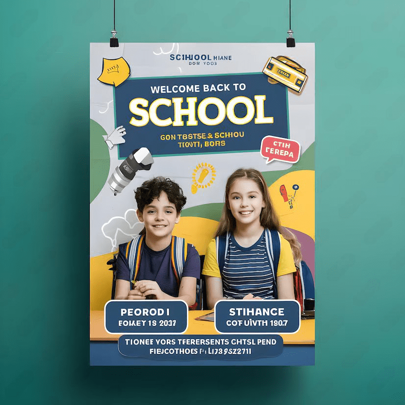
Why Typography Matters in Custom Poster Design
Typography is more than just selecting a font—it’s an art form that can elevate the design and messaging in your custom paper poster. The right font can grab attention, convey emotion, and create a cohesive message with your visuals. Whether you’re designing a custom poster for marketing, events, or personal use, choosing the right typography is crucial for impactful communication.
How to Choose the Best Fonts for Posters
When selecting fonts for custom posters, consider these critical elements:
- Readability: Choose fonts that are easy to read, even from a distance. Sans-serif fonts like Helvetica or Arial are great for headlines, while serif fonts like Times New Roman add elegance to the body text.
- Purpose: Align the font style with the goal of your poster. For example, bold and playful fonts work well for events, while sleek, professional fonts suit business promotions.
- Contrast: Use contrasting fonts for the headline, subheadings, and body text to create a visual hierarchy on your poster.
- Size and Scale: Ensure that your text is scalable and appropriate for your custom poster size. Larger text for headlines guarantees visibility.
To explore different design techniques, visit our guide on designing your own custom poster.
Typography Trends for Custom Posters
Typography trends shift over time, but some styles remain timeless. Here are a few current trends for custom poster typography:
- Minimalist Fonts: Clean and simple fonts like Futura or Proxima Nova are perfect for modern and professional poster designs.
- Handwritten Fonts: Fonts with a personal touch work well for personalized posters or creative themes.
- Experimental Typography: Break the rules by combining unique font styles to make an attention-grabbing poster for special events.
- Bold and Heavy Lettering: Large, thick lettering for headlines ensures your message stands out in busy environments.
Want more ideas? Check out popular poster design themes to find inspiration.
Visual Alignment: Blending Fonts with Poster Design
The visual alignment of your typography with your overall design is essential for creating harmony. Consider the following tips for optimal font placement:
- Ensure headlines command attention by positioning them strategically near the top.
- Pair fonts to create a complementary balance—mix bold styles for headlines with light ones for body text.
- Use grids to align text elements for a polished, professional look.
- Incorporate whitespace to prevent text overcrowding.
Learn about custom poster printing techniques that enhance your typography's visual impact.
Call-to-Action Tips for Business Posters
If your custom poster is for business and marketing purposes, the right typography can create strong calls-to-action (CTAs).
- Use action-driven words like “Join Now,” “Explore,” or “Sign Up Today.”
- Highlight CTAs using bold fonts or contrasting colors.
- Place CTAs strategically, such as in the middle or bottom of the poster for maximum visibility.
Explore creative printing for sustainable and eco-friendly poster printing options.
Explore Custom Paper Posters at PRINTDRILL
Ready to bring your typography ideas to life? Discover PRINTDRILL’s Custom Paper
