
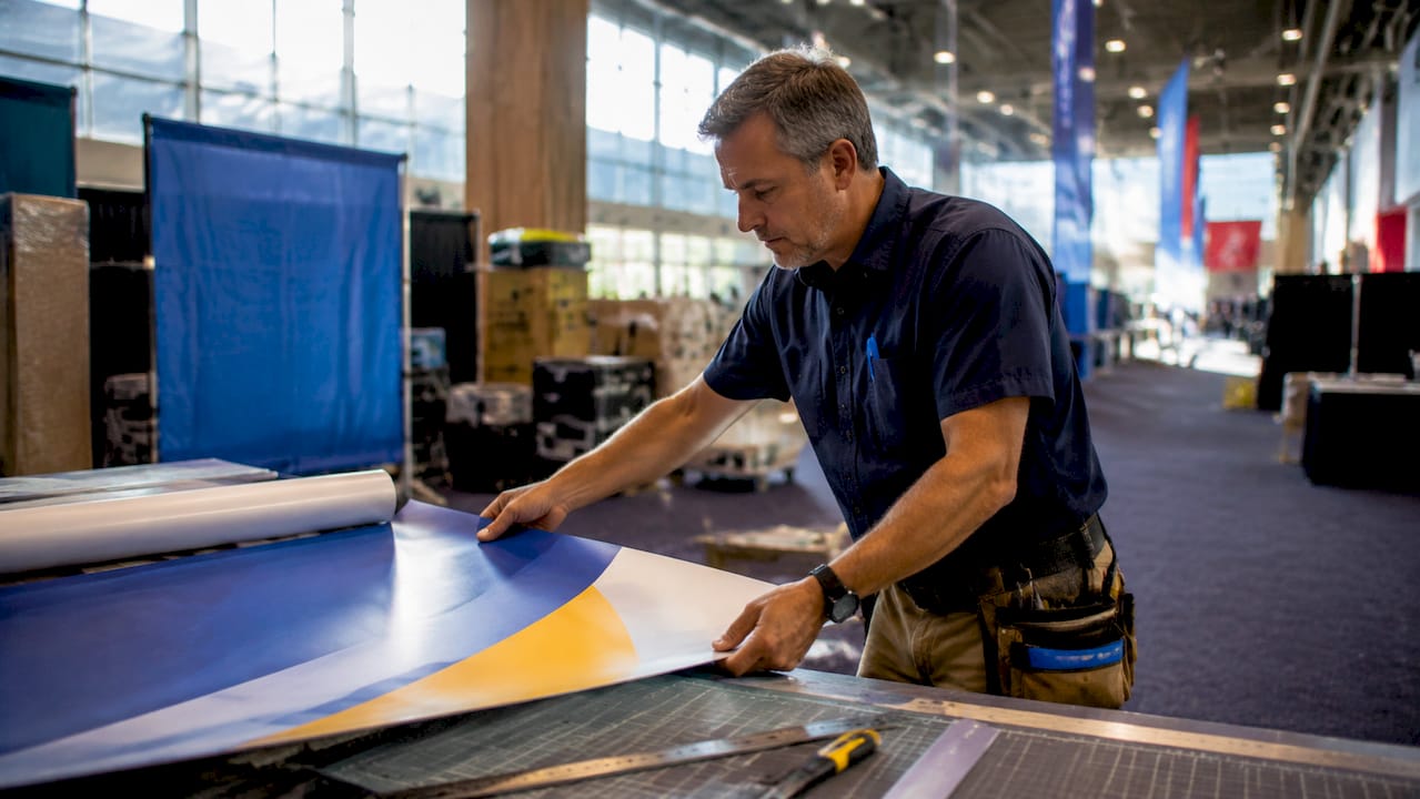
Why Booth Graphics Attract Attendees at Trade Shows
TL;DR:
- Effective trade show booth graphics quickly attract qualified attendees through high-contrast visuals, bold typography, and a clear core message. Proper placement at eye-level and strategic lighting enhance visibility and engagement, while targeted messaging pre-qualifies prospects and improves lead quality. Simplified design with minimal text and a dominant image ensures instant understanding and maximizes booth performance.
Booth graphics are the primary driver of attendee attraction at trade shows, working by delivering instant visual clarity within the 3–5 seconds a passerby takes to decide whether to stop. This is the core mechanic behind effective trade show display design, known in the industry as exhibit graphic strategy. The difference between a crowded booth and an empty one often comes down to contrast, message hierarchy, and placement, not budget. 81% of trade show attendees have purchasing authority, and 67% are new prospects. They stop only when the value proposition is immediately clear. This article breaks down exactly why booth graphics attract attendees and how you can design displays that convert foot traffic into qualified leads.
What visual elements in booth graphics draw attendees in?
Strong visual hierarchy and simplicity in booth graphics reduce cognitive load, making information faster to absorb from a distance. This is not a design preference. It is a functional requirement in a crowded exhibition hall where dozens of booths compete for the same eyes.
The most effective visual elements in exhibit graphics share three traits:
- High contrast color combinations. Pairings like navy blue with white, black with yellow, or deep red with cream register quickly at distance. Low-contrast designs force the viewer to work harder, and most won’t bother.
- Bold, large-scale typography. Messaging should be readable from 5–7 meters for maximum impact in crowded aisles. A font size that looks fine on a laptop screen often disappears on a 10-foot backdrop.
- Single dominant image or graphic. One strong visual anchor draws the eye faster than a collage of product shots. Brands like Apple and Nike use this principle at scale. It works at trade shows for the same reason.
- Minimal text. The booth is not a brochure. Your graphic should answer three questions: who you are, what you do, and why it matters. Everything else belongs in a handout.
- Outcome-focused headline. “Cut Hiring Time by 50%” outperforms “HR Software Solutions” every time. Attendees respond to results, not category labels.
Pro Tip: Test your booth graphic at reduced scale on a printed sheet. Stand 10 feet away. If you can’t read the headline in two seconds, the font is too small or the contrast is too low.
The importance of event signage goes beyond aesthetics. Graphics that integrate clarity, hierarchy, and action guidance turn a physical space into a clear visual message that works even before your staff says a word.
How does booth placement and layout maximize visitor engagement?
Graphics placed at eye-level and aligned with visitor movement help ensure messages are seen without forcing attendees to change direction or crane their necks. Placement is not secondary to design. It determines whether your design gets seen at all.
Here is a practical layout sequence that increases dwell time and guides visitors naturally through your space:
- Position your headline graphic at 5–6 feet high. This is the natural eye-level range for most adults walking an aisle. Anything above 7 feet becomes background noise in a busy hall.
- Create a clear entry zone. An open front with no tables or barriers signals accessibility. Attendees avoid booths that feel like they require commitment to enter.
- Place engagement graphics mid-booth. Product visuals, case study callouts, and demo screens belong in the center zone where visitors have already chosen to stop.
- Reserve the back wall for brand reinforcement. Your logo, tagline, and brand color field anchor the space and photograph well for social media, which extends your reach beyond the event floor.
- Use floor graphics to guide movement. Directional floor decals or color-coded zones tell visitors where to go without requiring staff intervention.
An open booth layout with clear zones for entry, engagement, and discussion guides visitors naturally and increases their dwell time. Open island designs, accessible from multiple sides, increase graphic exposure and visitor flow quality. If your floor plan allows it, an island configuration is the highest-performing layout for attracting visitors with visuals.
You can also review trade show banner sizing guidelines to match graphic dimensions to your specific booth footprint before ordering.
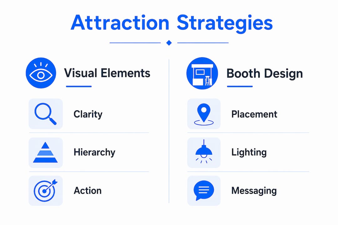
Does lighting actually improve booth graphics performance?
Lighting is the most underestimated tool in exhibit graphic strategy. Lighting can increase booth engagement by up to 30%, creating a welcoming atmosphere that guides visitor attention rather than overwhelming it. A 2024 Event Marketer report confirms this engagement increase with proper lighting design.
Backlit displays, specifically SEG (Silicone Edge Graphics) lightbox systems, solve a common problem in convention centers: uneven ambient lighting that washes out printed graphics. A backlit trade show booth system maintains consistent color saturation and contrast regardless of the venue’s overhead lighting conditions. This matters because your graphic may look perfect in your office and flat under fluorescent convention lighting.
Interactive features compound this effect. Interactive booths with touchscreens and AR experiences increase visitor retention time by up to 40%. Retention time is the metric that matters most for lead conversion. An attendee who spends four minutes at your booth is exponentially more likely to become a qualified lead than one who glances and walks on.
Fyber Live experts note that attracting visitors depends on purposeful design combined with human engagement, with lighting identified as a key but consistently underused tool. The practical takeaway: budget for lighting before you budget for extra printed panels.
Pro Tip: If your venue has dim or inconsistent lighting, specify backlit fabric graphics rather than standard printed panels. The color output difference is visible from across the aisle.
Why does targeted messaging improve lead quality over raw foot traffic?
More visitors is not always better. Message gates help pre-qualify visitors by industry, role, or problem scope before they interact with staff, improving lead quality over sheer volume of foot traffic. A booth that attracts 200 relevant prospects outperforms one that draws 500 curious passersby every time.
The table below shows the difference between graphics designed for volume versus graphics designed for lead quality.
| Design Approach | Goal | Typical Outcome |
|---|---|---|
| Generic brand awareness | Maximum foot traffic | High volume, low conversion rate |
| Role-specific copy (“For HR Directors”) | Pre-qualify by job function | Fewer stops, higher close rate |
| Problem-focused headline (“Still losing deals to manual quoting?”) | Pre-qualify by pain point | Highly engaged, motivated visitors |
| Outcome-driven visual proof (case study stat on graphic) | Build trust before conversation | Shorter sales cycle at booth |
| Gimmick-based attraction (games, giveaways) | Crowd draw | High volume, mostly unqualified |
Using industry-specific language in your headline copy acts as a filter. A graphic that reads “Supply Chain Risk Management for Mid-Market Manufacturers” will not attract everyone. That is the point. The attendees it does attract are already pre-sold on relevance. Your staff can skip the qualification step and move directly to discovery.
Visual proof on the graphic itself also builds trust before a single conversation happens. A stat like “Reduced onboarding time by 60% for 300+ clients” communicates credibility at a glance. Attendees who approach after reading that are already partially convinced. This is the core principle behind exhibition booth design for lead quality as a discipline separate from general event signage.
Promotional products and branded giveaways can support this strategy when they reinforce your message rather than replace it. Resources like conference promotional must-haves show how signage and physical items work together to capture and hold attention at industry events.
Key takeaways
Booth graphics attract the right attendees when they combine visual clarity, strategic placement, targeted messaging, and proper lighting into a single coherent display system.
| Point | Details |
|---|---|
| First impression window | Graphics must communicate brand value within 3–5 seconds to stop qualified attendees. |
| Visual hierarchy drives clarity | High contrast, bold fonts, and a single dominant image reduce cognitive load at distance. |
| Eye-level placement is non-negotiable | Graphics positioned at 5–6 feet high align with natural visitor sightlines in busy aisles. |
| Lighting multiplies graphic impact | Backlit SEG displays maintain color accuracy and can increase engagement by up to 30%. |
| Message gates improve lead quality | Role and problem-specific copy pre-qualifies visitors before staff interaction begins. |
What i’ve learned about graphics that actually work at shows
After working with exhibitors across dozens of industries, the pattern is consistent: the booths that perform best are not the ones with the most graphics. They are the ones with the fewest, placed with the most intention.
The most common mistake I see is treating the booth back wall like a product catalog. Exhibitors pack in logos, feature lists, partner badges, and social handles, and the result is visual noise that registers as zero to a walking attendee. One clear headline, one strong image, and one call to action outperform a fully loaded wall every time.
The second mistake is designing graphics in isolation from the staff experience. A graphic that says “Ask us how we cut costs by 40%” only works if every staff member at the booth knows the answer and can deliver it in 30 seconds. Graphics set expectations. Staff either confirm or destroy them.
The third thing I’ve observed is that exhibitors rarely test their graphics before the show. Print a scaled version, tape it to a wall, and walk past it at normal pace. You will immediately see what a walking attendee sees. Most teams skip this step and discover the problem on the show floor when it’s too late to fix.
Iterative design matters here. The best exhibitors I’ve worked with treat each show as a test. They change one headline, one color field, or one placement decision between events and measure the result in lead volume and quality. Over two or three shows, this produces a display that is genuinely dialed in for their audience.
— Printdrill
Build your next booth display with Printdrill
Planning a trade show appearance means getting your graphics right before the show floor opens. Printdrill produces custom fabric banners and custom mesh banners built for high-visibility display in both indoor and outdoor event environments.
For exhibitors who need a complete solution, Printdrill’s 10x20 tension fabric booth kit delivers a full display system with high-resolution printed graphics, modular hardware, and fast nationwide shipping. Free design assistance is available for every order. Whether you need a single backdrop or a full booth package, Printdrill makes professional-grade exhibit graphics accessible at any budget.
FAQ
Q: Why do booth graphics attract attendees so quickly?
A: Attendees decide to approach a booth within 3–5 seconds, so graphics that communicate a clear value proposition at a glance are the primary driver of initial engagement. High contrast, bold typography, and a single dominant visual are the fastest signals the brain processes in a crowded aisle.
Q: What is the most effective graphic placement at a trade show booth?
A: Eye-level placement at 5–6 feet high is the most effective position for booth graphics, as it aligns with natural visitor sightlines without requiring any change in direction or effort from the attendee.
Q: How does lighting affect booth graphic performance?
A: Proper lighting can increase booth engagement by up to 30%. Backlit SEG lightbox displays maintain consistent color and contrast in venues with uneven ambient lighting, making graphics more visible from a greater distance.
Q: What is a message gate in booth design?
A: A message gate is copy or a visual element in your booth graphic that pre-qualifies visitors by industry, role, or business problem before they speak with staff. It filters out unqualified traffic and improves the conversion rate of actual conversations.
Q: How many words should a booth graphic headline contain?
A: A booth graphic headline should contain 5–8 words maximum. The goal is a message readable in under two seconds from 5–7 meters away, which rules out full sentences or feature lists on primary display panels.
Recommended
- 10x10 SEG Backlit Trade Show Booth System - Illuminated Modular Suite – PRINTDRILL
- 10x20 Custom Tension Fabric Trade Show Booth Kit - Display with Racks – PRINTDRILL
- 10x20 Curved Tension Fabric Trade Show Booth - 20ft Exhibit Booth – PRINTDRILL
- 10x10 Custom Tension Fabric Trade Show Booth - Brand Focus Kit – PRINTDRILL
